Building cross-tenant views and Dashboards with Azure Lighthouse and Resource Graph
When you are granted access to a subscription it can be for a number of reasons. Whether it is to assess the environment and report back or to deploy new resources as part of a project. With the popularity of Azure Lighthouse growing, it is likely that you are granted access through Delegated Resource Management (when requesting access as a Service Provider I would always advise going the Azure Lighthouse way).
Whatever the reason you've received delegated access may be. You probably want to know what's going on and run an inventory to see what you're dealing with. This can achieved in a number of ways ways and Azure Resource Graph is one of them. Of course, this doesn't only go for newly received access. Querying Azure Resource Graph is always a good place to start when asking the environment "What's up!?!"
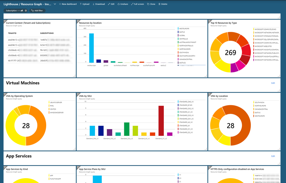
Azure Resource Graph is fully supported by Azure Lighthouse and delegated resource management. It allows you to gather information across tenants and it's pretty fast! You can even grab your queries and stick them to your Azure Dashboard. they will be executed based on your context as you selected through the subscription picker and update on the fly.
If you're looking for a more permanent solution based on Log Analytics. Take a look at the examples as provided here. Different use case but would help you achieve the same result ("What's up" vs "What was up").
For some of the queries you can use Azure Policy to achieve the same goal but as I explained in my previous blog post you first need to know what you want to deploy policies for and an Azure Policy takes time to kick in. When it's your first encounter with a new subscription or you just want to take a quick peak - that's probably not something you want to wait for. This is where Azure Resource Graph kicks in. It's non-intrusive and has no impact on the resources running in the target subscription.
The queries
For the queries I like to use often or to build upon - I'm keeping a running collection here. Each of them can be added to your dashboard by simply copying whatever is in between the quotes into the Azure Resource Graph Explorer. For example, a query such as the following:
Search-AzGraph -Query "summarize count() by location
| project location, total=count_
| order by total desc"
Would translate to a query in Azure Resource Graph Explorer like so:
summarize count() by location
| project location, total=count_
| order by total desc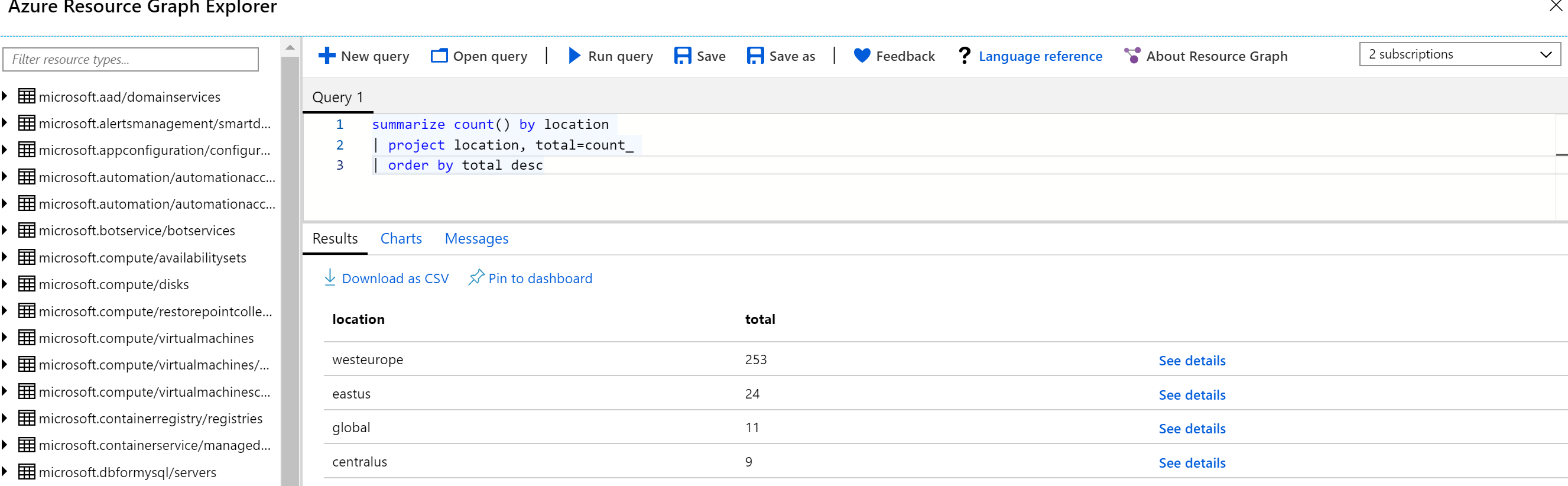
Now that's not too hard to accomplish. Let's go and create a Dashboard.
Creating a dashboard
Now, I'm a command line kinda guy and I'm not aspiring to be a dashboard guru. In general I like to hand that task to people who perform day to day monitoring of environments as they probably know much better than me what's good to work with.
But that's besides the point, we can still explain them how to use the Azure Resource Graph to get the data they need :)
To start, first create an empty dashboard or stick with the one you're using now (click "Dashboard" in the bar on the left of the portal). To publish the result of the query, we need to use the Azure Resource Graph Explorer. You can find it through "All Services" or just search for "Azure Resource Graph Explorer" in the portal.
This will provide you with the explorer ready to go. You can start by writing your own query or grab one here. Remember, you just need the query not the PowerShell stuff.
Before you run your query, you want to select the context you are going to run the query in. You can go with a single subscription, or run it across all the subscriptions you have access to.
Finally hit "Run query" and magic happens.
I like to store my queries to prevent future copy/pasting and you can do so as well by hitting "Save as" and give it a friendly name. In the future just hit "open query" and it's ready to be used once again.
No charts for you!
Now, depending on the query you can or cannot publish your results in a chart. Trying to represent the data as shown in the query above, won't work well and you're represented a message stating an incompatibility.
"The result set is not compatible with a pie chart visualization
Each row will be represented by a pie slice. Your query should produce two columns. The first column will be used as the label for the slice. The second column must contain numeric values that will be used to determine the size of the slice."
Fair enough, we're projecting 4 columns and none of them contains a numeric value.
The query we just used isn't really useful as we're not counting anything and we're already filtering on a state (stopped). If we want to create a more useful query that is fit for a chart then we would have to change it up for a bit. Let's say we're not filtering on a "state" of stopped and we're just going to request how many App Services are "stopped" and how many are "running".
For this you will need to summarize and count by the state we requested. What's happening is that the query will count how many App Services have a state of "stopped" and how many have a state of "running". We then project both the state and the count.
The query would look like this:
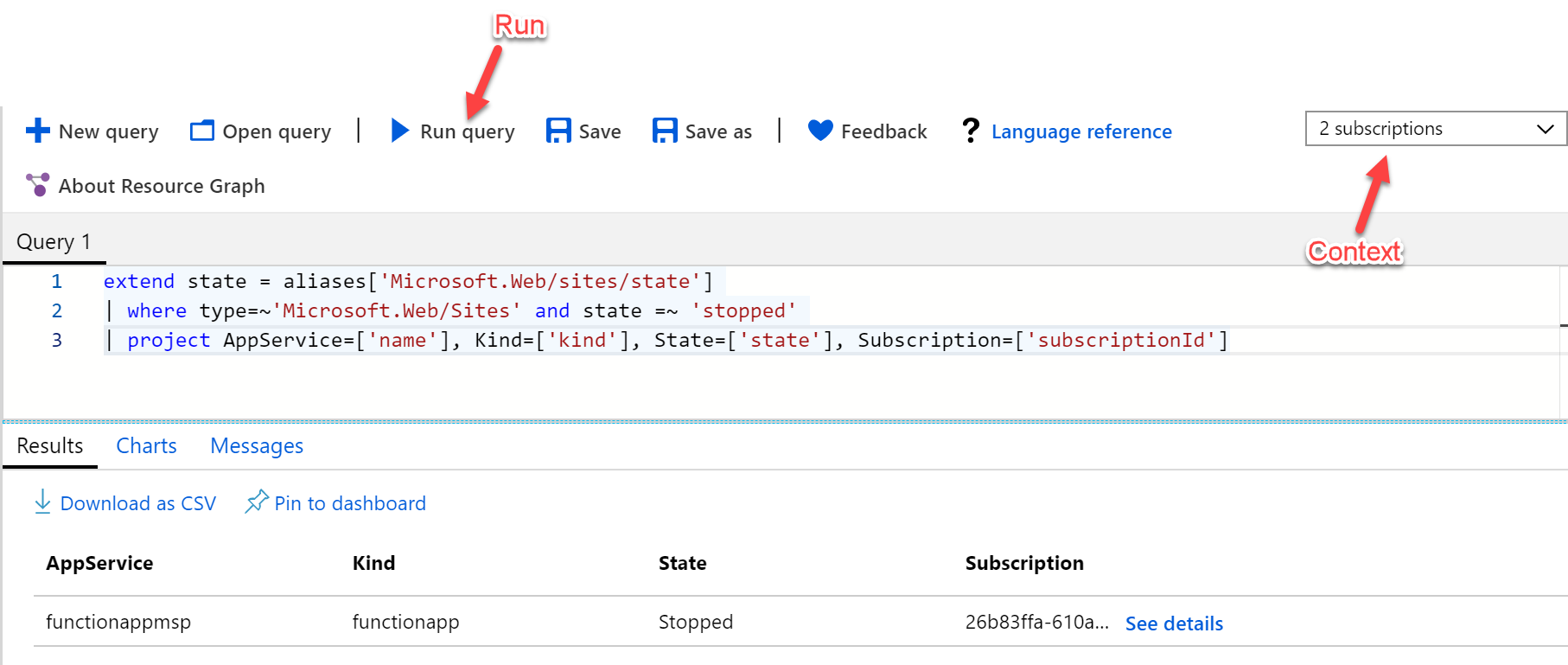
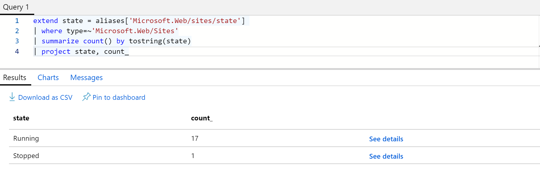
extend state = aliases['Microsoft.Web/sites/state']
| where type=~'Microsoft.Web/Sites'
| summarize count() by tostring(state)
| project state, Total=count_
And have a result similar to this:
If you're also using the results without generating a chart then you probably don't want your column to have a name of "state" and "count_" . Easy fix though, you can reference them when defining your own column names as such: "Project StoppedOrStarted= ['state'], TotalCount=['count_']".
You're now ready to click "Charts" once more and... Chart!
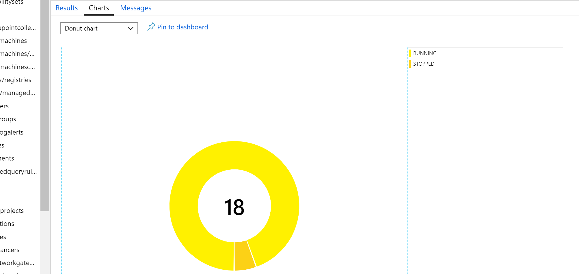
Charts with only two possible results are not the prettiest once but they illustrate the point. If you'd like to add this to your dashboard, simply click "Pin to dashboard" and it will appear. Now, on to the next query by just clicking "New query" (before you overwrite your previous saved query) and repeat.
Another way to achieve this is by editing your dashboard and selecting a "Resource Graph" tile from the gallery on the left.
What's cool about the dashboard is that it instantly updates once you change your context. Want a cross tenant overview? Just select them all, just as if you were using any other resource that is supported by Azure Lighthouse.
And that's it. Pretty easy right?! :)
